Buber App
*
Buber App *
Developed an app to streamline the reservation for booking a bike uber (Buber) in Ann Arbor.
Project Type
Course Project: ENTR 390 Digital Product Design
Skills
User Research
Information Architecture
Product Design
Interaction Design
Role
Digital Product Developer
Timeline
4 Weeks
How it Started
You’re cold. You’re tired. Every Uber/Lyft home is out of your budget, it’s a 30 minute walk home--you don’t want to walk, so what option is left? Ann Arbor’s favorite transportation method: Buber (Bike-Uber).
But finding a Buber isn’t always easy—most people rely on flagging one down on the street.
The Problem
Accessing bubers is unreliable and stressful, requiring either a driver’s personal contact or flagging one down by chance.
The Opportunity
How to make finding and booking bubers easier and more reliable for riders?
Design Decision #1
Interactive Elements
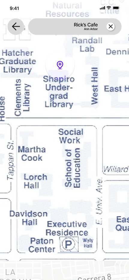
A current map of central Ann Arbor allows users to set their pickup destination for accurate and easy pick-up coordination.
Personalized location suggestions enhance ease of use and improve the app's reliability for riders.
Design Decision #3
Verify Driver Options
Personalize the ride by choosing which driver
Choose which driver works best through various ride details
Confirm the choice by a double-verification step to ensure safety and correct decision-making
Design Decision #2
Personalized Scheduling
Schedule rides for immediate pickup or book in advance using a built-in calendar feature, offering flexibility and convenience to fit user needs.
App Key Features
EMPATHIZE → DEFINE → IDEATE → PROTOYPE → TEST★
EMPATHIZE → DEFINE → IDEATE → PROTOYPE → TEST★
My process overview.
User Interviews and Observation Tests
Key Insights
Insight #1
Drivers rely on blaring music to attract attention, which can be effective but risks alienating some community members.
Insight #2
Users expressed a strong interest in booking features to simplify ride scheduling and avoid the unpredictability of flagging down a driver.
Insight #3
Users were unsure about pricing and services or found it inconsistent, which reduced confidence in the service.
➙
➙
➙
Opportunity #1
HMW make drivers more visible to potential riders without relying on disruptive methods?
Opportunity #2
HMW allow users to book rides conveniently for now or later?
Opportunity #3
HMW provide clear and transparent ride information to build trust and encourage more frequent use?
Iterations
With the key user needs identified and no existing solution effectively addressing them, I began designing, iterating, and refining the Buber app. Given time constraints, I prioritized testing 3 key elements with 3 users to ensure the design addressed their frustrations. This was critical as a solo designer, allowing me to validate my ideas and gather direct feedback to guide improvements. These included the color choices for the map, the animated app introduction, all of which were critical to addressing user frustrations and enhancing usability.
Old Map
Rejected ❌
Rejected ❌
New Map
Accepted ✅
During testing, one user mentioned that some clickable elements blended into the map background, making them difficult to see. To address this accessibility issue and prioritize clarity in my design, I decided to darken the map to ensure all interactive elements are easily distinguishable.
Introduction
Accepted ✅
For my app introduction, users expressed a desire for a more seamless and engaging presentation of the app name and brand. They suggested dividing the animations into three distinct parts to better emphasize the app's title and create a stronger first impression.
The Prototype
Learning and Reflections
Balancing Aesthetic and Functionality
I initially focused on creating a visually engaging design but realized that usability must always come first. For example, darkening the map to improve the visibility of clickable elements reminded me that user experience and accessibility are the foundation of any good design, no matter how aesthetically pleasing it may be.
The Power of Small Details
Adding animations to the app introduction and breaking them into three distinct parts to emphasize the app's title reinforced the importance of micro-interactions. These small details can have a significant impact on how users perceive and engage with a product, and I’ve learned to never underestimate their value.
The Importance of Clear Communication
Through user testing, I realized how critical it is to design with clarity in mind. Users consistently highlighted areas where visual or interactive elements felt confusing, such as the initial app introduction. This taught me that clear communication in design, whether through visuals or interactions, is key to ensuring a seamless user experience.


