La Onda Luxury Travel
MY UX FAIL!
MY UX FAIL!

One of the first things my GSI (graduate student instructor) told me was ALWAYS SAVE YOUR ITERATIONS. But unfortunately, I let my weaknesses get the best of me and mistakenly just decided to trust that the Cloud and Squarespace automatically saves version history. But (per exhibit A) THEY DO NOT! I am a very productive, passionate worker and I have the tendency to get so excited about the project I am working on that I don’t think about the future documentation. It has been a really tough lesson in balancing creativity with discipline.
Needless to say, this experience taught me the importance of maintaining a systematic workflow. It’s easy to get caught up in the excitement of a project, but skipping crucial steps like version control led me to setbacks; specifically, when building my portfolio. Moving forward, I’ve incorporated new habits like frequently saving backups, organizing files in folders by version, and utilizing tools that support reliable version history tracking. Now, I take pride in creating structured processes that allow me to stay productive and safeguard my creative work.
This failure, while frustrating, ultimately made me a more methodical UX designer. It reinforced that successful design is not just about creativity, but about consistency, documentation, and attention to the little things that ensure long-term success.
While I don’t have all of my working ITERATIONS, i do want to highlight the work I’ve done for la onda.
Project Description
La Onda is a boutique travel agency that strives to connect the client with personalized travel experiences that best fit their specific wants.
The vision for the website is to be a resource for aspiring travelers to learn about destinations, become inspired and trust La Onda Travel to be authority on where, when, why, and how to travel to these destinations. Site visitors should also understand what working with a travel agency entails and the value should be very understood.
WHAT I WAS ABLE TO ACCOMPLISH
-
When I first joined the La Onda team, the website faced a challenge: traffic was flat, and user engagement wasn’t improving. My task was to turn this around. To do so, I began by redesigning the site’s navigation, making it more intuitive for users to explore. I then established a consistent brand identity by harmonizing colors, fonts, and logos across all pages. To boost engagement, I incorporated strategic marketing patterns, like highlighting key words in articles and consistently emphasizing the contact page throughout the site. As a result, these efforts led to a remarkable 75% increase in site traffic, month over month.
-
When I first started working on the site, it was clear that the bounce rates were too high, and users weren’t staying long enough to engage with the content. I knew something needed to change. By reworking the layout and simplifying the navigation, I made it easier for visitors to explore the site. These updates created a more user-friendly experience, leading to a 30% reduction in bounce rates and increasing the average time spent on each page to 95 seconds—making the site much more engaging overall.
-
Another one of my goals upon joining the team was to increase our email subscribers and social media followers to bolster our newsletter campaign. Using UX laws such as The Mere Exposure Effect, I strategically placed subscribe buttons throughout the website, ensuring they were visible and accessible. This design decision resulted in a 25% month-over-month increase in email subscribers. By enhancing the user experience and leveraging UX principles, I not only achieved my goal but also fostered a more engaged audience for our newsletter.
A/B Testing
-
![]()
EX #1--pt 1
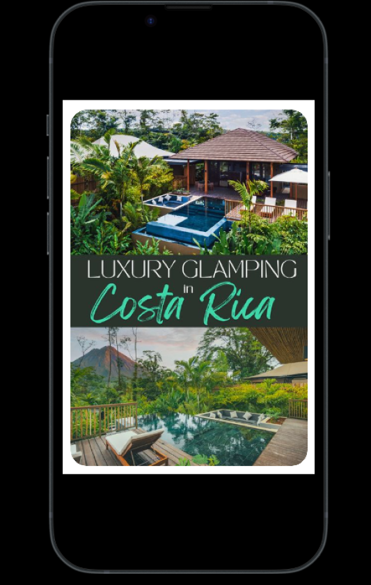
Conducted an A/B test on Pinterest to boost site clicks for a Costa Rica trip campaign. Designed and tested two variations of promoted pins, analyzing user engagement and click-through rates to identify the most effective design in driving traffic to the site.
-
![]()
EX #1 -- PT 2
This version of the pin saw a 15% increase in link clicks, contributing to improved campaign performance.
-
![]()
EX #2--Pt. 1
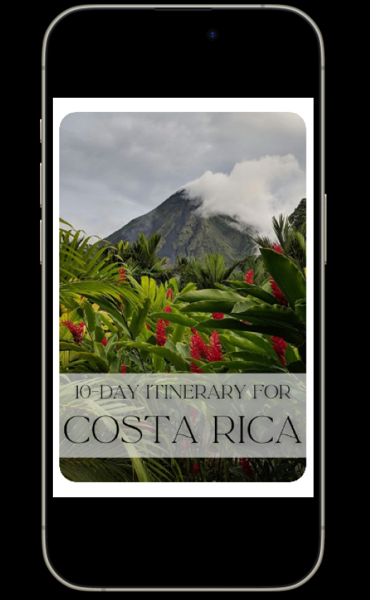
This A/B test was to evaluate the impact of different fonts on user engagement and readability for a website redesign. Created two font variations and measured user behavior, focusing on metrics like time spent on page, bounce rates, and overall satisfaction. The test results provided data-driven insights to select a font that enhanced both user experience and site aesthetics.
-
![]()
EX #2--pt. 2
This example was the winning pin in terms of increased user activity. The font used above was also implemented on the current La Onda site.
-
![]()
EX#3--pt. 1
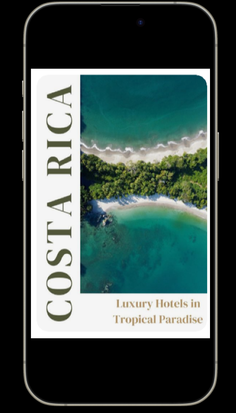
For this A/B test, we used Pinterest pins to experiment with two distinct layouts designed for Instagram Stories. The goal was to identify which layout would generate more traffic to external links. By analyzing user engagement metrics like click-through rates and impressions, we assessed which design elements were more effective at driving interaction. The test provided insights into how visual hierarchy and content arrangement can influence social media traffic, helping refine layouts for broader marketing strategies.
-
![]()
EX. #3--pt.2
This layout was not as successful as the one on the left.