Mi Maizey
*
Mi Maizey *
A redesign focused on streamlining the user process to create a more intuitive and accessible experience tailored to the diverse needs of students, faculty, and staff.
MiMaizey is the University of Michigan’s latest GenAI chatbot, designed to assist the U-M community with academic and administrative needs.
The redesign focuses on streamlining the user process to create a more intuitive and accessible experience tailored to the diverse needs of students, faculty, and staff. By improving navigation, refining instructional content, and enhancing accessibility features, the new design ensures a seamless interaction that empowers users to achieve their goals efficiently. Additionally, the updated interface prioritizes clarity and usability, making MiMaizey a more effective tool for the U-M community.
Project Type
Skills
Role
SI 310: Intro to UX
User Research
Information Architecture
Accessibility
Responsiveness
Communication
UX (Re)Designer
Timeline
10 Weeks
The Current Maizey Interface
“Well I don’t want Michigan to see what questions I ask AI.”
“I wouldn’t even begin to know how to use that.”
“I don’t understand why I need to upload my information into this AI system, OpenAI’s [Chat GPT model] is so much easier.”
Feedback I received that inspired me to choose to redesign Maizey
“Sorry, but literally what the f*ck is that.”
“But like I don’t understand why staff would need to use the same tools as me.”
My Assignment
Michigan ITS needs help with its AI tools. They are not getting as much traffic as they thought they would, and they are always looking to improve their tools. My assignment? Pick one of three tools to redesign: UM GPT, GPT-3 (Beta), or Maizey. My choice? Maizey. Why I chose it? Maizey is a GenAI chatbot supposedly designed for use by the U-M community, yet all the students and faculty I know remain unaware of its existence or purpose
The Problem
⚠️Maizey’s complicated interface and lack of marketing scare off most to all of its potential users.
The Opportunity
🌟HMW re-design Maizey to clarify instructional use and better communicate all of the benefits Maizey has to offer?
Plan to Action
-
10 Weeks
1 → 2: Research & Insights
3 → 4: Lo-fi Wireframes
5 → 6: Prototype Development
(5.5): Instructor Check-In for Feedback
7 → 8: Usability Testing & Refinement
9 → 10: Design Deck & Presentation
-
Improve Communication
→ Help users better understand how to navigate and utilize Maizey effectively
Enhance Adoption
→ Redesign Maizey to improve its appeal and usability, making it more accessible and marketable to U-M faculty and students
Better User Experience
→ Revamp the interface to simplify access to personalized assistance and relevant resources, while maintaining trust and ensuring system security
-
Timeframe
→ Maizey is a powerful tool with multiple capabilities, and a well-designed interface must thoughtfully account for diverse user pathways and options while paying attention to the finer details. Balancing these considerations made completing the full redesign within just 10 weeks a challenging task—especially while managing my other classes and jobs!
Technical Limits
→ While I truly believe UM ITS has some of the best services a University could offer, there were some features such as: linking external sites or reformatting the existing Key-Code request form, that we were not able to touch for this project.
Junior Designer Delay
→ As per the words of one of my Graduate Student Instructors, all designers have a creativity faucet. Initially, the designs that come out are almost always shitty, but as you let the faucet run the water slowly becomes better and cleaner. We, as designers— and humans— must learn to have some grace and patience with ourselves. Perfection never comes easy!
MY METHODOLOGY
EMPATHIZE
➝
DEFINE
➝
IDEATE
➝
PROTOTYPE
➝
TEST
★
EMPATHIZE ➝ DEFINE ➝ IDEATE ➝ PROTOTYPE ➝ TEST ★
User Flows
Based on the existing tool, I’ve identified my two user paths:
• Student Flow
• Faculty Flow
The idea here was that for users to be able to use the tool to its maximum capability, they need to understand that in order to get the best answers they need to tailor the system to their personal data. In order for the tool to give specific answers it needs specified data from the user themself.
*Ideally, there is a third potential user flow I would have liked to explore: GUEST PATH. However this was not a main focus, so I’ve decided to go for the necessary ones.
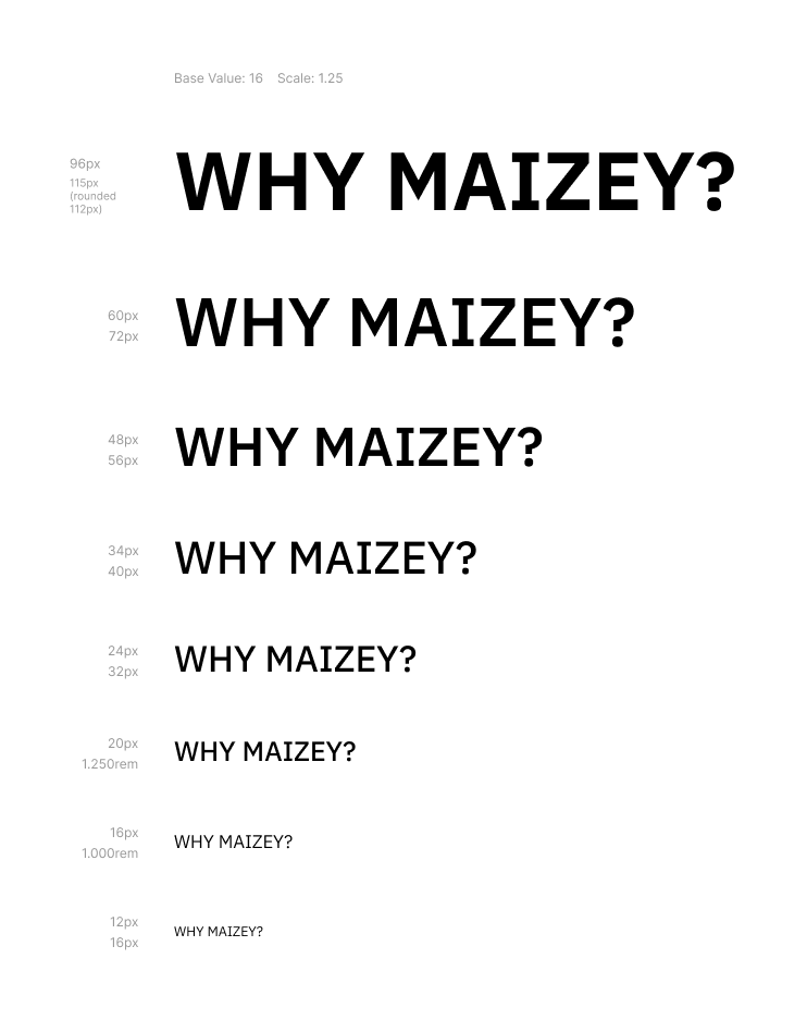
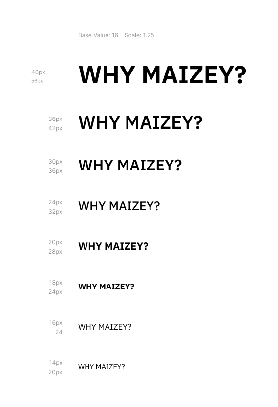
Site Styles & Typography
Desktop Styles
Site Color Styles
Mobile Styles
As one of my goals of the redesign was to better market Maizey to current faculty and staff it was important to me that my redesign seamlessly connected with the other UM GPT tools. One of the ways I ensured this was following the Michigan Style Guide. This creates a sense of uniformity across UM tools and clearly conveys that Maizey is made specifically for current staff and students at the University of Michigan.
Landing Page
The first change I wanted to make with the redesign was my landing page.
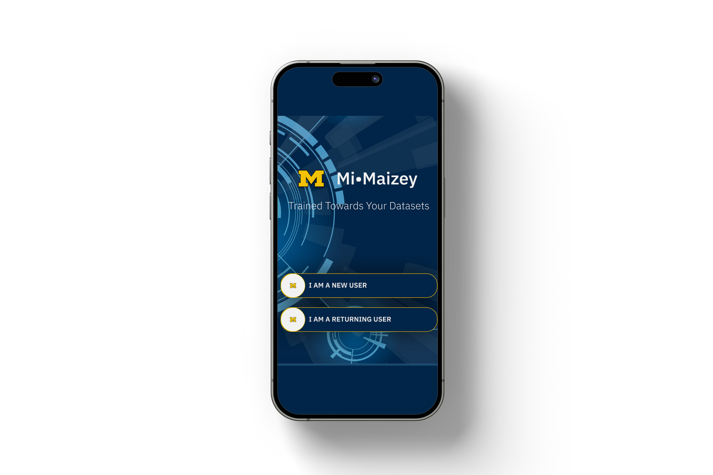
There are two purposes of this page. One purpose of this page is to guide returning users back to where they left off, i.e. either their Student/Staff Instruction page or to their main projects page. The second purpose of the page is to more clearly convey the specific use of the tool for students/faculty, differentiate it between the two other UM GPT tools (UM-GPT, GPT-Beta), and clearly outline the differences in use between staff vs. students.
It took three times, but I finally decided on a landing page that incorporated colors and fonts from the UM style guidelines and a large target area for user’s to easily pick up where they left off.
Below is my final design.


